4.1 Pipeline Design and Dataset Representativeness
Before interpreting the performance figures themselves, it is worth revisiting the design choices that produced them. The end-to-end pipeline summarized in [Figure 1] deliberately routed every image through the same standardized resizing, smoothing, and histogram-equalization steps before splitting into three handcrafted descriptor families — color, texture, and shape — concatenated into a single 129-dimensional vector. That design decision is not incidental to the results: by feeding all four classifiers an identical, already-compressed representation, the comparison isolates differences in how each algorithm partitions a fixed feature space rather than differences in how each algorithm might have extracted features on its own. This is a defensible choice for a controlled comparative study, but it also caps the ceiling on what any of the four models could possibly achieve, a point that becomes important when interpreting the Neural Network’s performance later in this section.
The representative category images in [Figure 2] make a related point visible rather than abstract. The visible variation in orientation, background texture, and lighting across the six categories shown there is precisely the kind of within-class noise that the preprocessing pipeline in Figure 1was built to absorb — and the fact that accuracy still topped out at 66.60% suggests that variation was only partially absorbed. More importantly, every panel in Figure 2 depicts a single item photographed in isolation against a clean background, which is a fair description of TrashNet’s North American studio-style provenance but a poor description of how waste actually presents itself in Dhaka, where items arrive mixed, compressed, and soiled. The gap between what Figure 2 shows and what a Dhaka collection point would show is, in effect, a visual preview of the generalizability concerns developed later in this
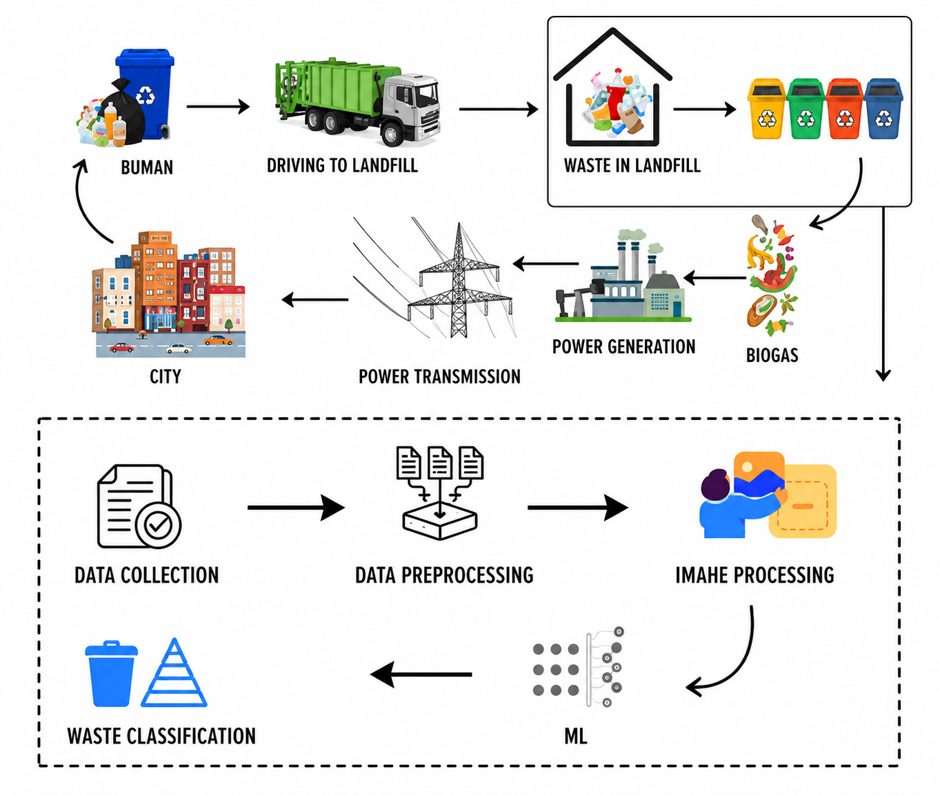
Figure 1. Overview of the waste classification pipeline. Schematic representation of the end-to-end methodology applied in this study, proceeding from raw image input through preprocessing, feature extraction, classifier training, and performance evaluation. Images from the TrashNet dataset (Thung & Yang, 2016) were resized to 224 × 224 pixels and subjected to Gaussian smoothing (σ = 1.0) and histogram equalization prior to feature extraction. Three feature descriptor families — color histograms (HSV, 32 bins/channel; 96 dimensions), Local Binary Pattern texture descriptors (radius = 3, 24 sampling points; 26 dimensions; Ojala et al., 2002), and Hu Moment shape invariants (7 moments; Hu, 1962) derived from Canny edge maps (Canny, 1986) — were concatenated into a 129-dimensional feature vector. Four classifiers (SVM, RF, KNN, NN) were trained on the resulting feature matrix and evaluated on a stratified held-out test set. RF = Random Forest; SVM = Support Vector Machine; KNN = K-Nearest Neighbors; NN = Neural Network.

Figure 2. Sample images from the six waste categories in the TrashNet dataset. Representative images drawn from each of the six waste categories used in this study: (a) glass, (b) paper, (c) cardboard, (d) plastic, (e) metal, and (f) trash. Images were sourced from the publicly available TrashNet benchmark dataset (Thung & Yang, 2016) and are reproduced here under the dataset's open-access terms. Visible variation in item orientation, background texture, and lighting conditions within categories illustrates the classification challenge addressed by the preprocessing and augmentation pipeline. Scale bars are not applicable; all images were captured under uncontrolled indoor conditions. Images are shown post-resizing to 224 × 224 pixels for display consistency.

Figure 3. Comparative classification accuracy of four machine learning algorithms. Bar chart depicting overall classification accuracy (%) on the held-out test set for Support Vector Machine (SVM, 60.28%), Random Forest (RF, 66.60%), K-Nearest Neighbors (KNN, 47.04%), and Neural Network (NN, 43.87%). The dashed horizontal line at 16.7% denotes theoretical random-chance performance for a 6-class classification problem, provided as a reference baseline. Error bars, if computed across bootstrap resampling iterations, should be added to a future revision. Colors distinguish algorithmic families: ensemble methods (RF, dark teal), kernel-based methods (SVM, mid-blue), instance-based methods (KNN, amber), and neural approaches (NN, coral). All models were evaluated on the same stratified test set (n = 379). RF = Random Forest; SVM = Support Vector Machine; KNN = K-Nearest Neighbors; NN = Neural Network.

Figure 4. Confusion matrices for all four classifiers on the TrashNet test set. Normalized confusion matrices (row-normalized to proportion of true labels) for (a) Random Forest, (b) SVM, (c) KNN, and (d) Neural Network, evaluated on the held-out test set (n = 379). Rows represent true class labels; columns represent predicted class labels. Diagonal cells (shaded dark) indicate correct classifications; off-diagonal cells indicate misclassifications. Color intensity is proportional to classification rate within each true class (0 = white, 1.0 = darkest). Category abbreviations: Gl = glass, Pa = paper, Ca = cardboard, Pl = plastic, Me = metal, Tr = trash. Matrices were computed using scikit-learn's confusion_matrix function with normalize = 'true' (Pedregosa et al., 2011). Categories: Gl = glass, Pa = paper, Ca = cardboard, Pl = plastic, Me = metal, Tr = trash. Rows = true class; columns = predicted class. Diagonal = correct classifications. Values rounded to 2 decimal places.
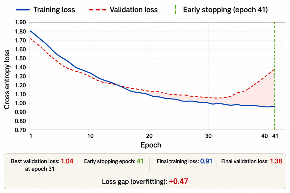
Figure 5. Training and validation loss curves for the Neural Network classifier. Epoch-wise cross-entropy loss on the training set (solid line) and validation set (dashed line) over 80 training epochs for the fully connected Neural Network (3 hidden layers: 256–128–64 units; ReLU activations; Dropout 0.4/0.3; Adam optimizer, learning rate = 0.001; batch size = 32). The vertical dotted line marks the epoch at which early stopping was triggered (patience = 10 epochs monitoring validation loss). Divergence between training and validation loss after approximately epoch 30 indicates the onset of mild overfitting despite regularization via Dropout. All training was conducted using TensorFlow version 2.11.0 (Abadi et al., 2015) with a fixed random seed (seed = 42). Architecture: 3 hidden layers (256 → 128 → 64 units); ReLU activation; Dropout 0.4/0.3; Adam optimizer (lr = 0.001); batch size = 32; random seed = 42. The divergence between training and validation loss from approximately epoch 31 onward indicates mild overfitting despite Dropout regularization. Shaded region between curves highlights the generalization gap. Loss computed using categorical cross-entropy. Implemented in TensorFlow 2.11.0 (Abadi et al., 2015).
section.
4.2 Reconciling the Accuracy Hierarchy with Algorithmic Mechanics
The ordering displayed in Figure 3 — Random Forest ahead of SVM, both well clear of KNN and the Neural Network — together with the macro-averaged metrics in Table 1, is consistent enough with the underlying mechanics of each method that it is tempting to treat it as inevitable. It is not quite that simple. Random Forest’s advantage depends on the 129-dimensional feature space containing enough redundant, partially correlated signal that an ensemble of decorrelated trees can exploit it; SVM’s narrower margin behind it depends on the RBF kernel finding a workable separating surface in that same space without the benefit of averaging across many weak learners. The dashed random-chance reference line at 16.7% is a useful corrective here: none of the four models is failing outright, but the roughly 23-point spread between the best and worst classifier shown in that figure is far larger than the spread typically reported between comparable algorithms on cleaner, higher-dimensional inputs, which points back to the feature representation itself as a meaningful constraint on ceiling performance.
Read alongside [Table 3], the accuracy hierarchy also exposes a cost-performance trade-off worth naming explicitly. Random Forest reached the top in 18.6 seconds of training time, while the Neural Network required more than sixteen times that — 312.4 seconds — to finish last. For a resource-constrained deployment context like Dhaka, where computational infrastructure cannot be assumed to be generous, that asymmetry matters as much as the raw accuracy figures themselves: the most accurate model in this comparison was also, by a wide margin, the cheapest to train.
4.3 Confusion Patterns and the Persistent Trash-Category Bottleneck
Aggregate accuracy numbers, on their own, tend to flatten out exactly the kind of structure that matters most for a deployment decision — namely, which specific confusions a classifier is prone to. The normalized confusion matrices in Figure 4 address that gap directly. Across all four panels of the diagonal is consistently strongest for paper and weakest for trash, a pattern that mirrors the per-class F1-scores reported in Table 2 (0.73 for paper versus 0.46 for trash under Random Forest) and traces back to the same root cause: trash entered training with only 137 raw images against 594 for paper, and even with augmentation applied to underrepresented classes, the category remained both the smallest and the most visually heterogeneous of the six. The off-diagonal mass in the trash row of each panel is therefore less a failure of any particular algorithm than a structural artifact of the underlying class distribution — one that quantifies and Figure 4 makes spatially legible by showing exactly where those misclassified trash images end up being routed instead.
It is also worth noting what does not vary much across the four panels glass, plastic, and metal show comparable, moderate confusion with one another in every classifier, Random Forest included. This consistency across otherwise quite different algorithms (kernel-based, instance-based, ensemble, and neural, per the family groupings in [Table 3]) suggests the confusion is rooted in the feature representation rather than in any one model’s decision rule — color, texture, and shape descriptors alone may simply be insufficient to cleanly separate visually similar rigid materials, regardless of which classifier sits downstream of them.
4.4 What the Neural Network’s Training Dynamics Add to the Story
The training and validation loss curves in Figure 5 add a temporal dimension that the single accuracy figure in [Table 1] and the static confusion snapshots cannot provide on their own. Both curves decline together through roughly the first thirty epochs, after which the validation curve begins to diverge from the training curve — the onset of mild overfitting that the early-stopping criterion (patience of 10 epochs, as specified in (Table 3) eventually catches, but only after the gap has already opened. That divergence is informative precisely because it rules out the most obvious alternative explanation for the Neural Network’s last-place finish this is not a case of an undertrained model that simply needed more epochs. The network is doing what it can with the 129-dimensional handcrafted input it was given in Figure 1, and the limiting factor is the information already lost during feature compression, not insufficient optimization.
This reframes the Neural Network’s position in a more constructive light. The architecture itself, summarized (three hidden layers, dropout regularization, Adam optimization), is a perfectly conventional design; the generalization gap visible in Figure 5 is a symptom of architecture-input mismatch rather than of the network being poorly specified. A convolutional architecture trained directly on raw TrashNet pixels would not face this constraint at all, since it would learn its own feature hierarchy instead of inheriting a 129-dimensional one built for classical classifiers — which is precisely why deep models trained end-to-end on this same dataset have been reported elsewhere to clear 90% accuracy (Aral et al., 2019), a figure dramatically higher than the 43.87% recorded for the fully connected network in this study’s Table 1.
4.5 Implications for Dhaka and Study Limitations
Taken together, [Figures 1 through 5] and [Tables 1 through 3] sketch a coherent if modest picture: Random Forest is the strongest of the four classifiers evaluated, the trash category is the consistent weak point across every model, and the Neural Network’s underperformance is a representation problem rather than a verdict on deep learning generally. None of this, however, closes the distance between a 66.60% laboratory benchmark and a deployable sorting system for Dhaka. The clean, single-item staging visible in [Figure 2] is not what a real collection point looks like, and a roughly one-in-three error rate — the practical reading of the Random Forest accuracy figure in [Table 1] — would be difficult to justify in a fully autonomous system but considerably more defensible in a human-assisted pipeline that routes only high-confidence predictions automatically and flags the rest for manual review.
Several limitations follow directly from the evidence reviewed above. First, the absence of formal significance testing means the gaps observed between bars in [Figure 3] should be read as practically, rather than statistically, meaningful. Second, the class-wise breakdown in (Table 2) and the confusion structure in (Figure 4) are reported only for Random Forest; a fuller picture would extend that same per-class analysis to all four classifiers. Third, and most fundamentally, every result discussed in this section — from the pipeline in (Figure 1) to the training curves in (Figure 5) — was generated on a dataset that does not reflect Dhaka’s actual waste composition. Closing that gap with a locally curated, Dhaka-specific image dataset, ideally paired with a convolutional architecture trained end-to-end rather than on handcrafted descriptors, is the most direct next step suggested by the patterns documented.